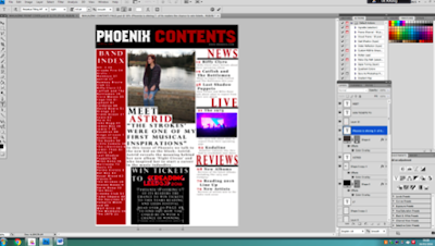
I add the black rectangle onto the blank file and then used the transform tool to make it the width of the page. I then pasted the masthead of my magazine onto the the black square; to make it white I used the blending options and changed the colour overlay to white. I used dafont.com to get the same font I used for my masthead to write the word contents. I then copy and pasted this onto a new layer; I once again added a colour overlay but this time it was a red overlay.
I then added the website address, issue number and the date underneath the contents page masthead. I did this in a relatively small font so that it didn't distract from the masthead. The issue number and date I placed underneath the magazine masthead in the same red font and the contents. And then the website address I placed underneath the contents in white font.
I added a red rectangle onto a new layer and then used the transform tool to adjust the size of it so that it filled up the rest of the left hand side of the contents page. On top of this rectangle I added two text boxes. The first one for "Band Index" which I type in white font and centred the text. The second one for the list of all of the bands that made a feature in the magazine and the pages number where you could find them.
I then opened the main image for my contents page and then copied it onto a new layer. I then used the transform tool to adjust the size of the image so that I could fit another column of text down the right hand side of the magazine.
Using the same front that I used for the "band index" and the headline on my double page spread, I wrote "news". I then added a thin black rectangle underneath this, to underline it as well as draw more attention to it.
Below the rectangle, I added a text book so that I could add the articles that came under "news" which included 2 of the articles that featured on my front cover. For the page numbers I put them in red font to make the stand out. I then wrote a small description of each article, I did this is a smaller font size and grey font.
I then added 2 more sections that followed the same style and layout as the "news" one. Underneath the "live" section I added a picture from a concert to help break up the text a bit better.
I added a white rectangle on top of the main image on my contents page. I then added some text onto of it in black font; after that I used the transform tool to adjust the rectangle so that it perfectly fit the text. I then duplicated this layer but used the transform tool to increase the length of it so that I could add some longer text. This time this text was in red because it was the most important out of the two and I wanted it to stand out.
Below the main image, I add a text box. In this text box I put a pull quote from the article and used a font size smaller than the headline for that article. Below the pull quote I added a brief description of what the article was about, I did this in a couple of font sizes smaller than the pull quote. I also put this description in the same grey font as the descriptions for the other articles.
Below the description of the main article in the magazine I added a black square that I could put an advertisement in. This advert was for a chance to win tickets to reading and leeds festival. I wrote the advert in white font but for the reading and leeds part I copied and pasted their logo onto a new layer. Then I used the transform tool to adjust the size and shape of it so that it fit well in the space.
I then copied the squares that I used for the page numbers on the double page spread and put it in the bottom right hand corner of my contents page. Above this I added another black rectangle on top of this I added a white text.
I then went onto google images and copied the app logos of 4 social media websites; Twitter, Instagram, Facebook and YouTube. I pasted each of these logos onto a new layer and lined them up on the black square and then used the transform tool to make them all the same size. Below this I added another textbox where I put the name of the magazines social media accounts. I also duplicated the page number square and then moved it on top of the main image and then added the page number of that article.


No comments:
Post a Comment